How can occupational therapy practitioners use labels to help our clients with dementia thrive in their environments?
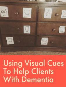
Well let’s back up… this post all started with this graphic.

I created these graphics so I would have these visuals ready to print and go in a pinch and wanted to share how I used them in practice with clients that have dementia. Because there were so many questions about the dresser visuals, I thought I’d go into how this works with our clients that have dementia.
All of the bedroom and kitchen pdfs and a micro learning video diving into this topic are available in the OT Flourish membership.
What is Concretization and What Does it Have to Do With Visual Cues in Dementia?
It is a “spontaneous form of compensation, concrete details or objects such as photographs could assist participants in reasoning about abstract matters and general coherence” (2) and is most effective for patients with mild – moderate dementia.
I use pictures and visual cues to not only help the patient “find” what they are looking for, but also help them participate in meaningful activities more independently, such as putting dishes away from the dishwasher or organizing clothes in their drawers.
What I think is most important, is to complete a thorough cognitive evaluation to make sure you have a good understanding of what their level of cognition is. This gives you the information you need to determine what type of visual cue (or any type of cue for that matter) is best (picture, words, picture and words together, etc)
6 Tips for Using Visual Cues in Patients with Dementia
1. Use Pictures and/or Labels
This makes sure the patient can identify and/or recognize the items that you are labeling and use the names of items that the client uses.
Example:
Use the term “skillet” instead of “frying pan” on the visual if that is the typical term used. The OT Flourish membership includes visual print offs for kitchen and bedroom labels.
In earlier stages of dementia, the client will be able to read and many times both the picture and the word is helpful, but as the disease progresses, this may be more frustrating or difficult to do, so typically I will remove the word from beneath the picture to make it easier for them and a more direct reference.
2. Create a Color Contrast
Print on high contrast paper if your patient has visual perceptual issues or low vision. Ask the patient what color they see best. I really like using a chartruse/lime green color and have had good results with it, but everyone is different, so go through the different colors with them and let them identify which is easiest to see.
3. Find the Right Height to Place the Signage
You want to make sure the visual is in their line of sight and obvious. They are not going to be looking for the sign, so putting it too high or low will not be effective. Also be sure to take into consideration if they are going to be sitting in a wheelchair or standing.
4. Give Directions to Items if it is Not in Their Line of Sight
Wayfinding is enhanced through signage, but sometimes, it cannot be placed directly on the object. Use of verbal directions (“bathroom down the hall”) may be appropriate for clients with low level dementia, but arrows or pictures might be better.
Example:
If the bathroom that is down the hallway, put a toilet sign on the wall pointing in the direction of the bathroom and then place another picture of a toilet on the door of the actual bathroom.
5. Link Colors to Rooms
Keep all colors in each room one color for consistency. If the bathroom has pink tile, make the labels pink to help them make the connection.
Examples:
- blue: bath room (water)
- green: outdoors (grass)
- orange: kitchen (burners on stove)
6. If Laminating Signs, Use Matte Laminating Paper
This is through my own trial and error. I originally thought that because I was putting visuals in the kitchen, they would get dirty from cooking on the stove, opening and closing drawers, etc. BUT, I also did not take into consideration that most laminating paper is high gloss, which makes it extremely hard to see for some patients with dementia.
These are not an end all, be all solution. Many clients will eventually get to the point that they cannot recognize objects or read, BUT it is really effective for the appropriate client!
Share below how you have used labels and visuals to help your clients with dementia be more successful in their environment.
Resources:
(1) Long-term care for people with dementia: environmental design guidelines
(2) Responses of persons with dementia to challenges in daily activities: A synthesis of findings from empirical studies. American Journal of Occupational Therapy, 58, 435–445.
(3) Using external memory aids to increase room finding by older adults with dementia


